Isarithmic Mapping: Annual Rainfall in Washington
Isarithmic Mapping
Today we are going to talk about Isarithmic Mapping!
This type of mapping is a way to explain smooth or continuous phenomenon such as a heat map, weather, temperature or rainfall.
There are two types of these kind of maps, Isopleth and Isometric...
Isopleth Maps: These are made from perceptual poi nt data such as the population of an area or the rate of crime in an area. These maps should be normalized if using raw data and should come from averages, densities, and ways to standardize the data. Such as the number of Covid cases per every 10,000 people, rather than coloring polygons of counties based on the number of covid cases.
Isometric Maps: These come from true point data, such as crime locations as points at a certain address or X and Y coordinate
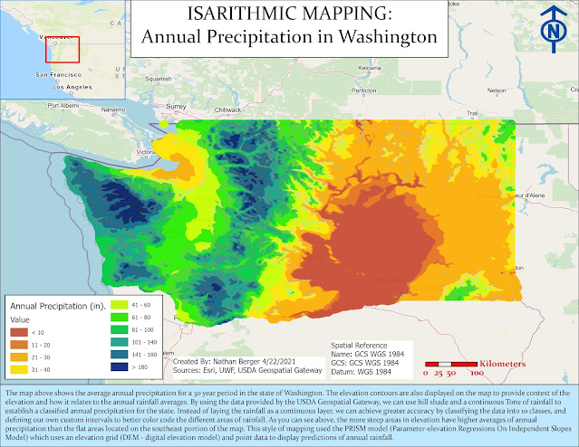
The map above shows the average annual precipitation for a 30 year period in the state of Washington. The elevation contours are also displayed on the map to provide context of the elevation and how it relates to the annual rainfall averages.
By using the data provided by the USDA Geospatial Gateway, we can use hill shade and a continuous Tone of rainfall to establish a classified annual precipitation for the state.
Instead of laying the rainfall as a continuous layer, we can achieve greater accuracy by classifying the data into 10 classes, and defining our own custom intervals to better color code the different areas of rainfall. As you can see above, the more steep areas in elevation have higher averages of annual precipitation than the flat areas located on the southeast portion of the map.
This style of mapping used the PRISM model (Parameter-elevation Regressions On Independent Slopes Model) which uses an elevation grid (DEM - digital elevation model) and point data to display predictions of annual rainfall. The Int Spatial Analyst Tool was used to calculate the contours clearly in classified intervals to allow the tone of elevation to be displayed.
What is hypsometric tinting?
This method of coloring different
elevation values to enhance relief cues or make it easier to see the depiction
of relief areas. In
clearer terms it means that an analyst will display colors in between contour
lines to represent different elevation between areas. This allows the map
reader to make out the contour differences and it can be an accurate
representation of the elevation.
Refer to the map above…
This is an example of hypsometric tinting in
which we calculated contours which the Int Spatial analyst tool. The data is
classified as discrete and not continuous. This identifies areas of rainfall
with natural breaks using 10 data intervals. We can clearly see the difference
in the two maps above and below, as the one below has more color, defined areas of rainfall,
contours, are more visible, and we do not loose visual detail on the map.
The advantage of this method is that each
cell in the dem is given a value so that its color is represented clearly, and
we do not lose the visual detail on the map.
The data is accurately portrayed as it layers over the different
elevation areas with contour lines. This gives the analyst full control on the
colors used, data intervals, elevation ranges for the contours, and it shows
the differences between features.
A major disadvantage of this method is that the analyst will have to go
in and classify the data, create intervals for each data classification, assign
colors, and the map can look pixely or busy to a map reader.
a)
Continuous Tone: (Shown in the map below)
What is continuous tone symbology?
Example From NOAA: Heat Map
https://www.climate.gov/news-features/event-tracker/heat-wave-broils-us-southeast-over-memorial-day-weekend-2019
Advantage of this color tone method is that the visual of the thematic data on the map is smooth, so it is not choppy and there is no stepped appearance to the tinting. A major disadvantage to this method is that when you assign the color ramp, you have less control over the colors used to classify the data. We can also loose detail on the map due to the tones not classifying as many intervals as you would with the discrete method, therefore loosing visual appearances. However, sometimes the continuous method is great for a fluid like look to a map.
Follow these links below for more information:
http://wiki.gis.com/wiki/index.php/Isarithmic_map


Comments
Post a Comment