Posts

Showing posts with the label Computer Cartography

3D Graphics In Google Earth

Image
What is Google Earth? Google Earth is a wonderful GIS application for rendering 3D models on the fly. Google earth can export GIS data from Arc Pro as KMZ files straight into google earth, such as the map example you see above .The benefit of Google Earth, is that you get a ton of layers such as cities, populated places, water and land features, grid coordinates, and updated imagery of your current area. We can overlay more recent thematic data content from other software such as Arc Pro and display it into Google Earth. From there we can do analysis such as measurements, historical imagery comparison, azimuth shading and lighting, and look at landmasses / infrastructure in 3D. Google earth can "go back in time" and look at transportation, land features, and it provides imagery across the entire world.  Google Earth can allow a GIS user to export graphics, create tour guide videos, and relay thematic data across a landscape in 3D extremely fast. See the images below for some ...
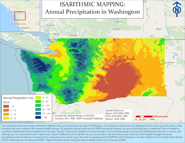
Isarithmic Mapping: Annual Rainfall in Washington

Image
  Isarithmic Mapping Today we are going to talk about Isarithmic Mapping! This type of mapping is a way to explain smooth or continuous phenomenon such as a heat map, weather, temperature or rainfall.  There are two types of these kind of maps, Isopleth and Isometric . .. Isopleth Maps : These are made from perceptual poi nt data such as the population of an area or the rate of crime in an area. These maps should be normalized if using raw data and should come from averages, densities, and ways to standardize the data. Such as the number of Covid cases per every 10,000 people, rather than coloring polygons of counties based on the number of covid cases.  Isometric Maps : These come from true point data, such as crime locations as points at a certain address or X and Y coordinate The two rainfall maps of Washington below are Isopleth maps as they are using perceptual data of areas regarding their average rainfall in the state of Washington. This data is already standardi...
Image
 Hello everyone! Happy Friday 😎 Today we are going to discuss... Choropleth Map Making! Specifically Proportional Symbols &  Graduated symbols What is a Choropleth Map? A choropleth map is a thematic map in which areas are shaded or patterned in proportion to the measurement of the statistical variable being displayed on the map, such as population density or per-capita income. Today we are going to show a population density map of European countries and the amount of wine they consumer based on liters per capita. This is a great example of a Choropleth map in relation to the way we visualize data gradually over a geographic area.  What projection  did I use? Europe Albers Equal Area Conic Why? This conical coordinate system is great for areas or counties that expand east and west rather than north and south. For this map, that projection makes sense when distributing the data. Our data of population density is countries across multiple countries ...

Data Classification: What works for your data?

Image
 Today we are going to talk about data classification! Specifically, we are going to talk about how to dispaly the same data, but color it and classify it in different ways to display different meanings. This leads to conveying a message of a map, and how you want the data to be presented.  The map below is actually a layout of 4 maps, with the exact same data. The color scheme is the same, but the data classification's are different for the four maps. As you can see, the maps are displaying data completely differently based on how the data is classified in the legend.  Look at the following Classifications below... So, which one do you think is the most accurate, or displays the data the best way? Let's look at the following classification types... Standard Deviation The standard deviation distribution shows how far data is from the average or mean of a dataset. This way the data can be shown with multiple standard deviations from the mean using fractions. A histogram ca...

Ward 7 Public Schools in Washington D.C.

Image
  Hello everyone! Today I decided to experiment with a completely new color scheme for my mapping lab assignment.   I went with purple!   I am not sure why, but it just seemed right at the time... The map above is unique as today we are going to focus on our main talking points staying within the realm of Cartography. In particular, we are going to talk about Visual Hierarchy, and the map making process following Gestalt's Principles. As a GIS analyst, we must look at making maps and visuals as a graphic design process as well as a scientific process. This means that maps need to have a theme, a feel, and most importantly provide context to the map reader in a way that makes sense.  Before we dive into the map above, lets explain what visual hierarchy is and the Gestalt Principles! Gestalt's Theory is as humans, we see or perceive the whole of something before we actually make out the individual parts. When you see a landscape, you see the landscape first, then the ...

Typography: Overview of the State of Florida

Image
  Today I want to talk about Typography and how it relates to Cartographic principles . The map displayed above is an overview of the state of Florida.   The capital city, main cities, rivers, lakes, and swampland are displayed above.  So how does this map represent the state of Florida in regards to Typography? Typography is the font, color scheme, theme, and overall display of a map. Therefore, I used a neutral gray themed background, with the dark canvas base map, gray headers, black font, and light gray canvas inset map as an overview of the state. I felt as if this color scheme really highlighted the main cities and water features I wanted to display on my map with bright colors. The green capital star, the red cities, and blue water ways really standout and highlight the main objective of the map. As you can see, the labels are easy to read as well. I used italics for the water areas such as the labels on the rivers.   With ex...

Cartography: How To Make A Great Map

Image
Let's Talk About Map Making Design Principles!  Cartographic Principles lead to good maps... These principles allow us to understand maps, read maps, and use maps to solve complex problems. The science of designing maps follows a set of rules to help guide us in the map making process. In doing so, excellent maps can be produced to solve real world problems.  This concept is known as "Cartography" OR "The science of drawing maps" A map, essentially, is a drawing or depiction of a geographic area displaying data and relationships between objects and space. It can have a theme, colors, symbology, data layers, text, pictures, coordinates, grids, and all sorts of information.  We use map design principles to create maps that make sense, and maps that inform people of spatial information relative to a geographic area. This process helps us answer the following questions... Why do we make maps?  Does this map explain the information clear...

Introduction to Cartography: Get to Know Me!

Image
Hello Cartography Class!  My name is Nathan Berger and I am a student here at UWF in the online masters program in GIS.  I currently live in the state of Georgia, and I work as a Geospatial Intelligence Analyst in the U.S. Navy Reserve, as well as a GIS Crime Analyst at the Athens Clarke County Police Department.  I love learning about GIS and ways to solve complex problems to support the national defense of our country, as well as benefit the safety and security of our local community. I would consider myself a mid-level analyst, with very basic programming skills. I love teamwork and helping others in collaboration. Feel free to reach out to me on the e-learning discussion board. You can also email me at anytime. I hope to learn a lot about dot density mapping , 3D analysis, web applications, managing dashboards, Python programing, etc. in this program. I also would love to learn more advanced remote sensing techniques to improve my imagery skill sets. The biggest ...