Data Classification: What works for your data?
Today we are going to talk about data classification!
Specifically, we are going to talk about how to dispaly the same data, but color it and classify it in different ways to display different meanings. This leads to conveying a message of a map, and how you want the data to be presented.
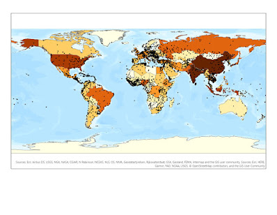
The map below is actually a layout of 4 maps, with the exact same data. The color scheme is the same, but the data classification's are different for the four maps. As you can see, the maps are displaying data completely differently based on how the data is classified in the legend.
Look at the following Classifications below...

So, which one do you think is the most accurate, or displays the data the best way?
Let's look at the following classification types...
- Standard Deviation
- The standard deviation distribution shows how far
data is from the average or mean of a dataset. This way the data can be shown
with multiple standard deviations from the mean using fractions. A histogram
can represent the data and the probability within the dataset.
- Equal Interval
- The standard deviation distribution shows how far data is from the average or mean of a dataset. This way the data can be shown with multiple standard deviations from the mean using fractions. A histogram can represent the data and the probability within the dataset.
- This classification method is used to divide the range of attribute values into subcategories or ranges of equal value. You can set the number of intervals, and the class breaks. Class 1 could be 0 – 10, class 2 could be 11-20, and class 3 could be 21-30. All are equal in value.
- Quantile
- This type of data classification is great for ordinal
data to show rankings. The total number of features in each class is the same.
There are no empty classes in a quantile distribution, and the more classes you
have the better.
- Natural Breaks - This one is my favorite!
- This data classification method is based on the
Jenks Natural Breaks algorithm. This method groups similar values together and
maximizes the differences between classes. The classes usually are quite
different from one another.
- This type of data classification is great for ordinal data to show rankings. The total number of features in each class is the same. There are no empty classes in a quantile distribution, and the more classes you have the better.
- This data classification method is based on the Jenks Natural Breaks algorithm. This method groups similar values together and maximizes the differences between classes. The classes usually are quite different from one another.
Now let's take a look at 4 more maps. However, these are displaying the age of people 65 or older, based on the population density. So people per square mile is the area calculation. We call this normalizing the data, or putting it in relation to population density.

By displaying data distribution across population
density, you can establish the number of senior citizens per square mile which
is extremely accurate in density mapping. By not doing so, you are falsely
reporting areas of data. By looking at
all 4 maps of population count normalized by square mile, you can see that all
4 maps concentrate to the northeast portion of Miami Dade County. But the other
4 maps based on percentage above 65 tell a different story, showing areas to
the west and mid-south having high concentration of senior citizens. This is not
the case. These percentages are low, and kind of skew the reader into thinking
that these areas have a large population. By doing population per square mile,
we are “normalizing the data” to show how many senior citizens live here over a
continuous range of data.
If there was a high percentage of COVID in a county,
we might be concerned. But, if we knew there was 10 cases for every square mile
or 1 in every 10 people are getting COVID, that is a lot more serious. Showing
a percent does not really give you a nice total to go off. If an area has
senior citizens of 31 percent, that means that 31% of the people in that
polygon are senior citizens. But it does not mean that there are a lot of
people in that area, so if 100 people live there, then 31 of them are senior
citizens. That is not a lot of senior citizens to target.


Comments
Post a Comment