Cartography: How To Make A Great Map
Let's Talk About Map Making Design Principles!
Cartographic Principles lead to good maps...
These principles allow us to understand maps, read maps, and use maps to solve complex problems. The science of designing maps follows a set of rules to help guide us in the map making process. In doing so, excellent maps can be produced to solve real world problems.
This concept is known as "Cartography"
OR
"The science of drawing maps"
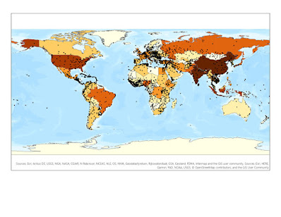
A map, essentially, is a drawing or depiction of a geographic area displaying data and relationships between objects and space. It can have a theme, colors, symbology, data layers, text, pictures, coordinates, grids, and all sorts of information.
We use map design principles to create maps that make sense, and maps that inform people of spatial information relative to a geographic area. This process helps us answer the following questions...
Why do we make maps?
Does this map explain the information clearly?
When was this map made?
How old is the data?
Where is this map located?
Can we read the map?
Can we interpret the map to understand the message it is trying to convey?
These are all great questions regarding the map making process. It is how we build maps that are accurate, easy to understand, and convey the message we want to send as a GIS analyst. Usually maps are made to help with navigation, solve a problem, or inform people of certain phenomena occurring in a certain region or geographic area.
Good Maps: These make sense, and they are easy to understand


Bad Maps: These maps make no sense are difficult to understand


In this process, we use the 20 Tufteisms as a kind of rule book during the map making process. These 20 rules are detailed below. They help GIS users build good maps, with strong messages that are easy to convey.
- 1. Graphical excellence is the well-designed presentation of interesting data – a matter of
- substance, of statistics, and of design.
- 2. Graphical excellence consists of complex ideas communicated with clarity, precision, and
- efficiency.
- 3. Graphical excellence is that which gives to the viewer the greatest number of ideas in the
- shortest time with the least ink in the smallest space.
- 4. Graphical excellence is nearly always multivariate.
- 5. Graphical excellence requires telling the truth about the data.
- 6. The representation of numbers, as physically measured on the surface of the graphic itself,
- should be directly proportional to the numerical quantities represented.
- 7. Clear, detailed, and thorough labeling should be used to defeat graphical distortion and
- ambiguity.
- 8. Write out an explanation of the data on the graphic itself. Label important events in the data.
- 9. Show data variation, not design variation.
- 10. In time-series displays of money, deflated and standardized units of monetary
- measurement are nearly always better than nominal units.
- 11. The number of information-carrying (variable) dimensions depicted should not exceed the
- number of dimensions in the data.
- 12. Graphics must not quote data out of context.
- 13. Above all else, show the data.
- 14. Maximize the data-ink ratio.
- 15. Erase non-data-ink.
- 16. Erase redundant data-ink.
- 17. Revise and edit.
- 18. Forgo chart junk.
- 19. If the nature of the data suggests the shape of the graphic, follow that suggestion.
- Otherwise, move toward horizontal graphics about 50 percent wider than tall.
- 20. The revelation of the complex.
There are also 6 Commandments used when making maps...
1. Map Important Data That Actually Matters
2. Don't Lie With Maps
3. Label Maps Correctly
4. Cut Out Data That Doesn't Matter, "Clear Up The Clutter", More Is Less\
5. Use Your Map Layout Carefully
6. Review Your Map Before Publishing It
2. Don't Lie With Maps
3. Label Maps Correctly
4. Cut Out Data That Doesn't Matter, "Clear Up The Clutter", More Is Less\
5. Use Your Map Layout Carefully
6. Review Your Map Before Publishing It
If you follow the 6 commandments and the 20 rules above, your map making skills will greatly improve. This whole process is the science of map making, which falls under cartographic principles. We want to make maps that are easy to read, easy to understand, and maps that can solve complex problems. We want the ability to inform policy makers to make the right decision using the most accurate data available, and presenting it in a way in which they can understand the map's message. Failure to do so results in bad decision making, confusion, and poor GIS analysis.
We want to be ethical and do the right thing. A lot of map makers use statistics and bad map making habits to present false information to viewers. This is very common during election years, or even in marketing when companies want to present maps to market their product. An example would be a cell phone carrier company showing a map of all the locations in the United States where you can get 5G coverage. They could easily skew the polygons of area coverage to make it look like they have more coverage than they actually can provide. They can also use symbology to confuse the map reader such as similar colors, brightness, and limited information.
Example:

T-MOBILE NATIONWIDE 5G. (2019, DEC 02). T‑Mobile 5G: It’s On! America’s First Nationwide 5G Network Is Here. https://www.t-mobile.com/news/press/americas-first-nationwide-5g-network
I am not saying that T-Mobile is lying about their network coverage, but I am saying that this map could be skewed to represent more coverage than what actually is provided by the company. Doesn't it look like they provide 5G to almost the entire country? The colors used for 4G and 5G are very similar, aren't they? Seems to be a little bit misleading...


Comments
Post a Comment