Multispectral Imagery Processing

Erdas Imagine and Arc GIS Pro: 

Spatial Enhancement for Multispectral Imagery


Hello again! Today we are going to be using some Multispectral Imagery in Erdas Imagine and Arc GIS Pro. Our imagery has up to 6 bands, and can detect Infrared signatures (False Color for vegetation and other land features. We can classify our imagery and use different symbology based on the band colors and pixel values in our imagery to distinguish different land features. 

The imagery used today was provided by UWF through the USGS Landsat 4-5 TM C1.\

https://glovis.usgs.gov/


Here are some steps that will need to happen in order to export out our maps...

1. Examine the histogram for shapes and patterns in the data.
2. Visually examine the image as grayscale for light or dark shapes and patterns.
3. Visually examine the image as multispectral, changing the band combinations to make certain features stand out.
4. Use the Inquire Cursor to find the exact brightness value of a particular area.

Histograms are key when conducting raster analysis of any kind!

By using histograms, we can see how the data is distributed across a satellite image to determine the different pixel values for each land feature. Snow and Ice will have a certain pixel value for bands 5 and 6 in our image, but it will differ greatly on other bands such as 1 and 2. Each band in our raster if reflecting different energy that is captured using binary code for our pixel cells. We have a total of 6 bands, each with its on histogram of data containing pixel values. This is how the software color codes the image, based on the pixel values and what color we use to identify each band/layer. 


This is how we color our image based on the different land features: 

LANDSAT Thematic Mapper and the Electromagnetic spectrum 

                        Band 1 – Blue 0.45 - 0.52 μm

▪ Mapping coastal water areas

▪ Forest types mapping

▪ Identifying cultural features

Band 2 – Green 0.52 - 0.60 μm

▪ Distinguishing healthy vegetation

▪ Identifying cultural features


Band 3 – Red 0.63 - 0.69 μm

▪ Discriminating different plant species

▪ Soil boundaries

▪ Geological boundaries

▪ Identifying cultural features


Band 4 – NIR 0.76 - 0.90 μm

▪ Vegetation biomass

▪ Crop identification

▪ Soil / crop and land / water contrasts


Band 5 – SWIR 1.55 – 1.74 μm

Band 7 – SWIR 2.08 - 2.35 μm

▪ Moisture content of plants & soil

▪ Crop drought studies

▪ Discrimination between clouds, snow, and ice

▪ Geologic rock types and soil boundaries


Band 6 – LWIR 10.4 - 12.4 μm

▪ Thermal analysis 

ALL 3 MAPS BELOW USE THE SAME IMAGE - JUST FYI...


For feature 1, I used the Near Infrared False Color symbology to highlight vegetation as red, waterways as black, and snow icy areas as a white color. By using the bands as Layer 4 for red, Layer 1 for green, and band blue for Layer 2, I could distinguish the different features clearly based on my pixel values. I used the inspector tool when looking at my raster to drop pints n my image to see at what location the pixel values were based on each layer in my raster. That is when I noticed that the water features in my image contained the pixel values between 12 and 18 for layer 4. This is where I had a spike of pixel counts in my histogram for layer 4 as well. I then clicked on more water areas (rivers and lakes in black-ish dark green) to confirm my theory, and it was the result I was looking for. 

For feature 2, I used the same process as I did for the first feature, except I changed my symbology of the raster to a Truer Color band display. I set the red band to Layer 1, the green band to layer 2, and the blue band to layer 3. I could easily distinguish the forests from the rivers and snow mountainous area. I used the inspection tool again and clicked on different land features to see what the pixel values were for each layer. When I clicked the snowy mountain caps displayed in white, my values fell within the 9 to 11 range for layers 5 and 6. They also were close to the 200-pixel value which is where the spike occurred on my histogram for layers 1 through 4. 


For feature 3, I exported a natural color image from Erdas to arc GIS Pro. I then selected the same true color from feature 2, however I adjusted one of the bands as a custom set up. I changed the red band from layer 1 to layer 5. The green band was set to layer 2, and the blue band to layer 1. This allowed me to define the changes in water depth, as I could clearly see the lighter shades of blue near the coastal water areas, versus the dark shades of blue for the large rivers and water features on my raster. This seemed to be the only color band scheme that worked well to display the water depth differences. I panned across my image to verify that the colors worked for water depth differences, and then exported my image pout. 

We can use the different bands to color all sorts of data, thus solving a lot of complex questions such as the following...

  • Healthy vegetation growth vs. unhealthy vegetation
  • Cloud Cover
  • Construction and Deforestation
  • Water features
  • Snow and Ice
  • Water depth
  • Air Quality
  • Military 
  • Drug Trafficking for Law Enforcement
  • Precision agriculture
  • Marine Mammal Detection
  • Coastal wetlands / Erosion
  • Mapping Severe Flooding
  • Mineral Patterns of Rock and other verities


Comments

Popular posts from this blog

TIN's vs. DEM's: 3D Elevation Models In Arc GIS Pro

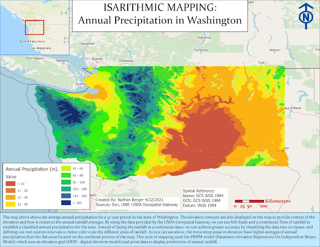
Isarithmic Mapping: Annual Rainfall in Washington

Ward 7 Public Schools in Washington D.C.