Projected Coordinate Systems
Today is a blog post on Coordinate Systems!
There are two main types of coordinate systems:
Geographic (GCS) and Projected (PCS)
We simply want to take data mapped in our world (3D) and lay it on a flat map. This is called projecting it into 2D. A GCS is where the data is located and a PCS is how to draw that 3D data on a flat map. I would think of a GCS a globe, while a PCS is a flat rectangular map you see in a textbook. However, when we project Geospatial data onto a flat surface, there will be distorted data such as the shape, size, area, direction or angle of the object being projected.
This is why it is crucial to understand the different kinds of coordinate systems to accurately portray your data on your map. The ones I will be showing you below are Conical Projected Coordinate Systems and are great for doing world maps. These would not be great to use for using local maps for states, counties, or cities.
https://www.esri.com/arcgis-blog/products/arcgis-pro/mapping/gcs_vs_pcs/
https://pro.arcgis.com/en/pro app/latest/help/mapping/properties/coordinate-systems-and-projections.htm


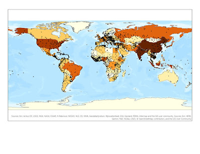
Here are some examples of Projected Coordinate Systems Below:
 |
| Robinson Projection |
 |
| Patterson Projection |
 |
| Natural Earth Projection |
 |
| Mercator Projection |
According to (Brewer, 2016) the distance and area distortion on the Mercator projection increases severely toward the poles. The Mercator projection preserves the angles of objects and feature classes in a projection. However, it does not preserve the size of an object. As the distance from the Equator to the Poles increases, the land is more distorted showing large land masses near the South Pole and North Pole (Antarctica for example) and smaller land masses near the equator.
So, the Mercator projection does not accurately display the actual size or mass of the Earth’s most northern and southern latitudes showing large landmasses that are not accurate to size. It will still show that a circle is a circle, but that the circle is much larger than a circle near the Equator. Africa is one of the largest continents in the world. Yet in the Mercator projection, Europe and Greenland look substantially large and Africa looks like one of the smallest continents in the world.
Did you know that in most school textbooks Mercator is used for World maps?
This means we are teaching our youth that countries are the same size across the world and providing inaccurate sizes. Africa is 14 times larger than Greenland in the Mercator map above. Yet the map shows Africa the same size as Greenland?
Here is another example of a Projected Coordinate system for Canada:

In the map below, I created a map of Quebec, Canada, in which I used the NAD 1983 Quebec Albers Coordinate system

§ Geodetic
Datum
The Datum is North American 1983 (CRCS) which uses
the 180 spheroid from the Geodetic Reference System. This is very similar to
the WGS 1984 spheroid in which the datum is earth-centered, or the earth is the
center mass of the datum.
§ Family
The family is a Conic projected coordinate
system which uses two standard parallels with the 1/6 rule to determine the latitude
ranges for the coordinate system.
§ Type
The type is an Albers type Coordinate system which
means the projected coordinate system uses equal area of distortion to project
areas or land masses that need equal area size and shape. This a great type for
a country in which the area is so closely accurate and direction is mostly
accurate, and the distortion lies mainly in the distance and scale.
Below is a map of the State of Georgia
The coordinate system used is NAD 1983 Georgia Statewide Lambert U.S. Feet

I decided to choose the state of Georgia since it is where I live, where I was born, and where I currently map GIS data for Clarke County regarding the Athens-Clarke County Police Department (ACCPD). I am very passionate about making Georgia a better and safer community, which is why I work as a GIS Crime Analyst for the ACCPD.
The reason for choosing the NAD 1983
Georgia statewide Lambert (U.S. Feet) is because the state of Georgia falls
within two state plane coordinate systems, East, and West. The state also falls
within two UTM zones, 17N and 16N. Therefore, I used a custom system for the
state of Georgia under the state systems projected coordinate systems section
in Arc GIS Pro. I feel as if NAD 1983 is more accurate than NAD 1927 due to
recent updates in the projection using the 1983 spheroid.


Comments
Post a Comment