Colors: Bringing Maps to Life
Choropleth Mapping using Colors in GIS
Basics In Color
In GIS, we use colors to display point, polygon, vector, and raster data in a way in which the user can understand the map. Colors help identify terrain, natural vegetation, or even icons of interest on a map. Today we are going to talk about how a GIS user can manipulate colors to display Choropleth maps regarding population changes, land use, and unique color ramps.
 |
| Working with RGB and HSV Colors |
Tha image above shows RGB values and HSV values. These values are how the GIS user selects the hue and saturation of values to derive meaningful symbology to data on a map. As you can see, by changing these values we can alter colors such as keeping the hue (red for example) but altering the saturation of light to create shades of light red and dark red. By changing the hue into a divergent color ramp, we can have symbology that uses multiple colors and shades from light to dark. Working with the hue and saturation in how the map reader perceives the color of data is critical in trying to convey the message of a mp.
Linear progression

Adjusted progression

ColorBrew

In (Brewer, 2016) Chapter 3, the text references variation in lightness so that data values that are low are lighter and data values that are high are darker. This would be represented well with the Color Brewer color ramp, as the lighter color classes are easier to depict rather than the linear and adjusted color ramps. The Color Brewer results vary from the adjusted progression and the linear progression because the intervals between color hues are more random and change more frequently. There is greater color differentiation when using the color brewer symbology and the colors are more profound than the other two-color ramps.
For example, the 6th class of the lightest shade of green for Color Brewer is significantly lighter than the linear and adjusted progression color ramps, with the interval for green in the RGB shading being less than the other two ramps.
However, Color Brewer has great intervals in the red and blue shading of RGB, and the values are much higher than the values of red and blue for the other two-color ramps which helps the color appearance appear brighter. The linear and adjusted color ramps only focus on changing the intervals of the green shading; however, color brewer uses all 3 color shades to make the colors vary from class to class.
https://colorbrewer2.org/#type=sequential&scheme=BuGn&n=3
https://en.wikipedia.org/wiki/Cynthia_Brewer#:~:text=ColorBrewer%20is%20an%20online%20tool,It%20was%20launched%20in%202002.
Altering Hue & Saturation to group Land Features together

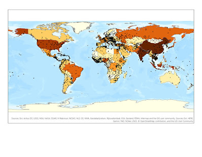
Look at the map below in how we can use a sequential color ramp by keeping a similar hue, but alter the saturation to provide a classification map of population data.

Divergent Color Ramps

I used a 5-class symbology with the natural break’s
classification method which then changed to a manual interval due to creating a
class break as the middle class in the color ramp. I used a divergent color
scheme with the Color Brewer RGB hue and saturation values from blue to red. I
used a class break of 0.28% which is the average percent change of all the
counties in Georgia. I used the negative range of 1.3% to this average as a
white “neutral” zone to show that counties in this class experience no increase
or decrease. I felt that 5 classes were enough to show counties with a
decrease, a significant decrease, an increase, a significant increase, and
counties with no percent change.

The legend displays the 5 classes as percentage intervals
with blue being positive and red being negative, representing an increase in
population and a decrease in population. I used the to word to display the
interval ranges. I also based the intervals on the natural break’s intervals,
as well as labeling the middle class (my class break of the state percent
change average) as no significant change so that the map reader can clearly see
the counties with no change.


Comments
Post a Comment