Infographics In GIS
Bringing Data To Life
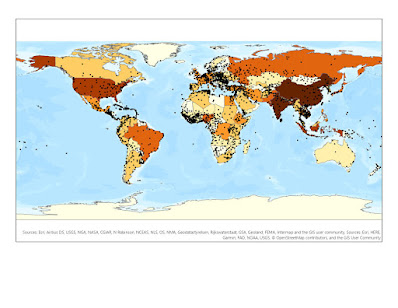
The art of data science, statistics, business intelligence, and GIS...

Positive Correlation

In a scatter plot, we can compare two variables. If the line is a linear progression running from SW to NE, then you have a positive correlation. this means that the two datasets you are working with are related to each other. This makes sense seeing that a lack of sleep can cause mental distress in most individuals.

Georgia


As you can see, the state of Georgia experiences mental distress % rates per county and insufficient sleep % per county in the top 10 of all states in the country. This is where I live and have experienced most of my life. This made me curious, so I wanted to see which counties had the highest rate of insufficient sleep percentages and which counties had the lowest/. I currently do not live in the highest which made me feel a bit better...

visual contrast – For visual contrast, the background of the infographic is a dark grey, and the rest of the graphics and maps display a bright saturation of purple and blue colors. This allows the data to pop and stand out to the map reader throughout the entire infographic. This visual contrast complements the scatter plot, pie chart, infographics, the maps, ads well as the bar graphs and charts. Purple is the main color for mental distress throughout the product, and blue is the color used for insufficient sleep. This allows the visual contrast to follow both variables throughout the product without confusing the message conveyed to the map reader.
Legibility – The map is easy to read, using legends
to demonstrate the data classifications on both maps. The Georgia label in white
is also legible and the font used contrasts to the dark background of the map. All
statistics, graphics, charts, and graphs are displayed with the same background
of dark grey throughout the infographic, making the labels for data, legends,
gridlines, and visuals easy to identify and visualize.
figure-ground organization – The figure-ground is not
expressed as much in this infographic; however, the data of the counties being
colored on both maps does sit on top of the basemap. This allows the data to
almost come to life in a sense and demonstrates the importance of which
counties have a darker saturation in color on the map. The states are flat and
orientated to the ground with no terrain or hill shade extruding any kind of 3D
visuals. The counties are represented as they should eb within the state
boundaries which are outlined in black to provide the visual of the states
being separated from each other.
hierarchical organization – The maps are both located
at the top of the infographic, as well as some summary statistics to have the
reader first read the facts and see what two maps of data are being compared.
The reader then can read the map legends to understand the percentages for each
county across every state for the USA. A bar graph is represented underneath to
show the averages of each state in comparison to the data displayed in the two
maps above. Then, the reader can either view the bar charts on the right
specific to the state of Georgia or see the positive correlation scatter plot
of the two variables shown in the maps. Last, are the pie chart and infographic
of data regarding mental health distress. The key here was using colors to
separate the statistics and charts so that the map reader understands where to
look as they move their eyes down toward the bottom of the product.
balance – Overall, the infographic has maps at the
top, but the statistics and charts are placed in different areas to allow
separation and flow throughput the product. The product follows the rule of
thirds, in which there are three sections of the product starting with the maps
at the top, charts in the middle, and graphics at the bottom. Each map has its
own separation, and each summary statistic has a border to allow the map reader
to see different visuals throughout the product.


Thank you very much Aaron! I'm glad you liked the article and I appreciate the links you dropped in your comment.
ReplyDelete